Coherent Solutions had evolved into a global technology consultancy, but its visual identity no longer reflected the scale, sophistication, or breadth of its capabilities. As the company expanded into new markets and service offerings, it needed a more modern, flexible brand system that could communicate complex technical solutions with greater clarity while standing apart in a crowded technology landscape.
My Role:
Art Direction
Visual Identity
Design System
Campaign Design
Coherent Solutions
The Challenge
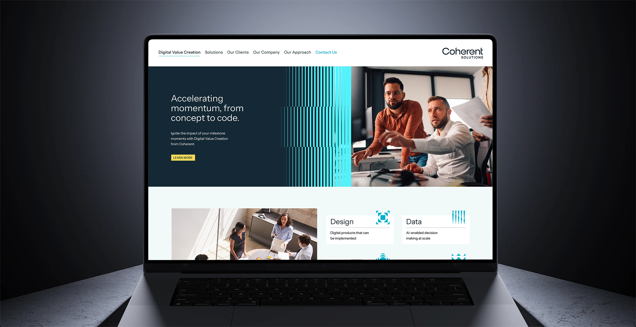
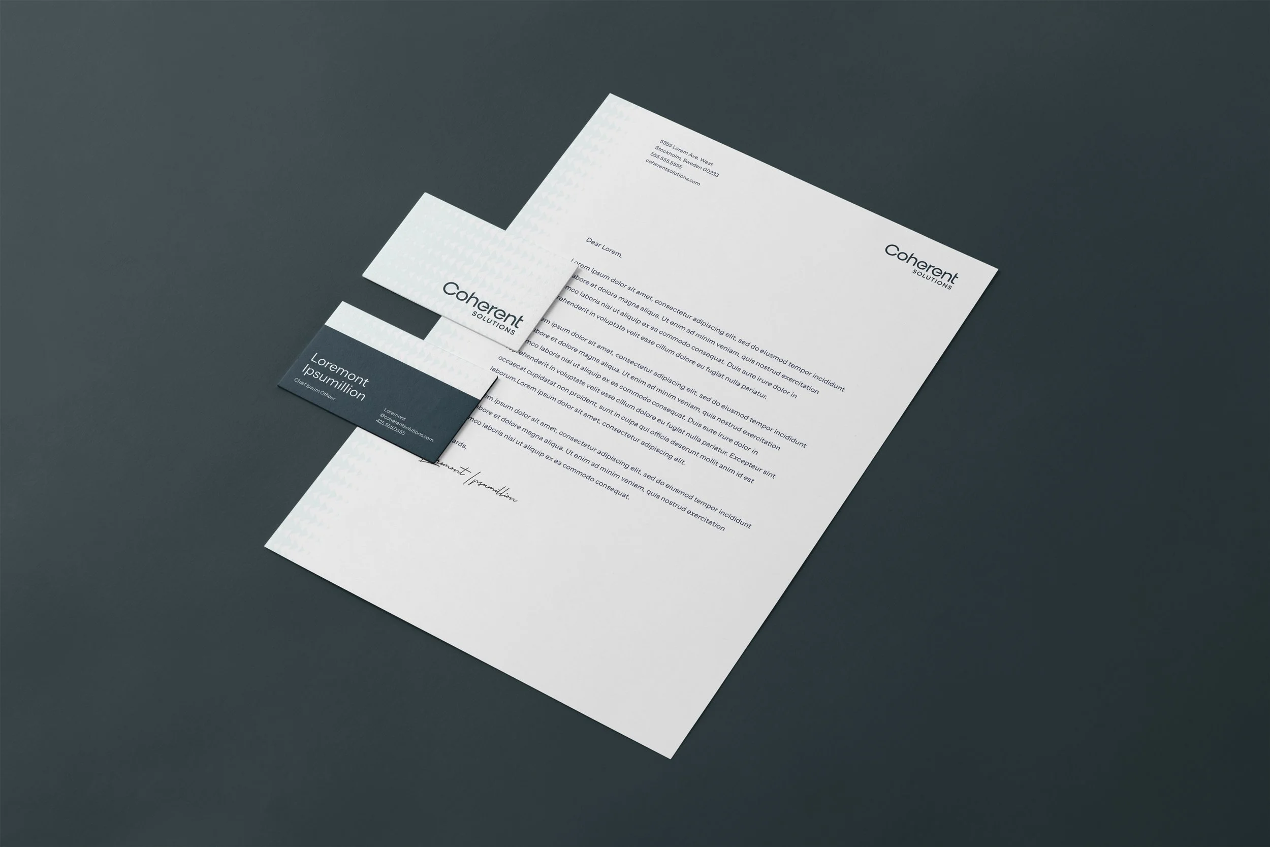
As the lead designer, I partnered closely with strategy and client stakeholders to translate research and positioning into a scalable visual identity system, creating a cohesive framework that strengthened brand recognition, simplified communication, and supported the company across digital, print, marketing, and sales touchpoints.
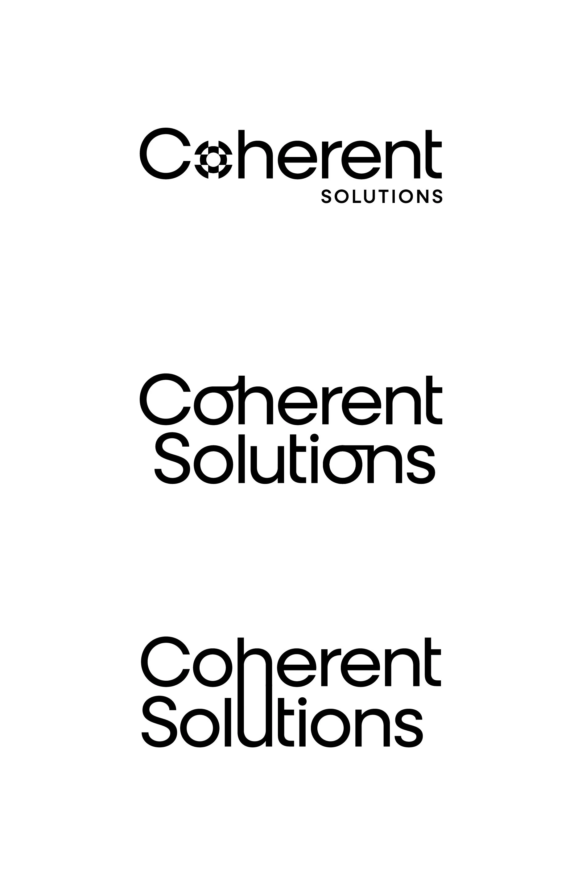
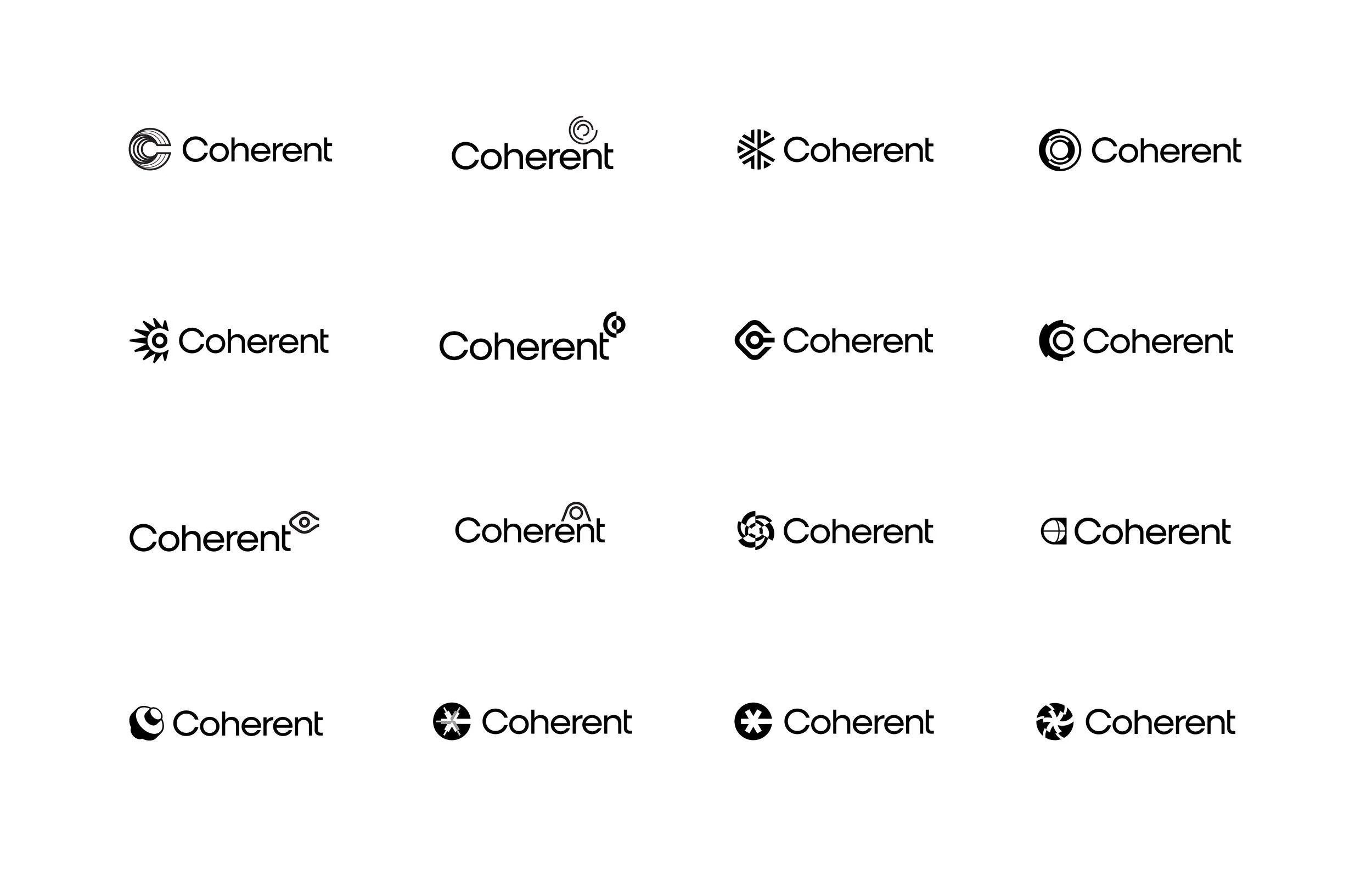
Logo Exploration
Some core themes the company wanted to convey through its visual identity were: Clarity, Alignment, and Momentum.
Final Logo & Colors
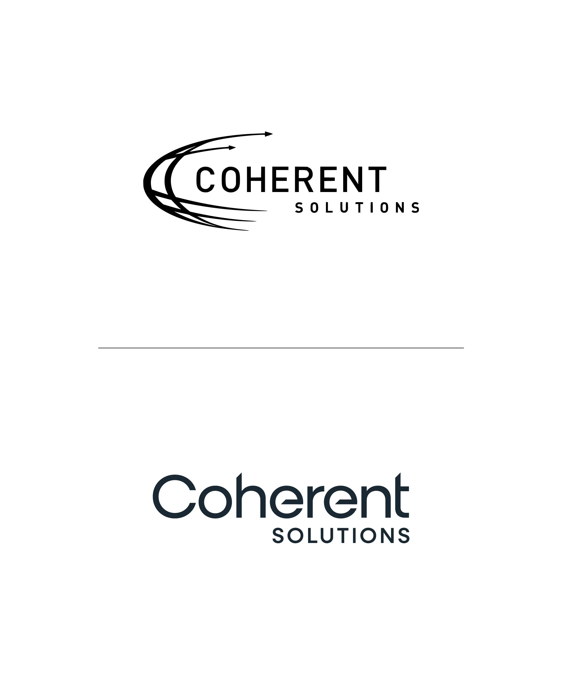
Previous Logo
New Logo
The final logo omits an icon and features sharp, matching terminals to convey alignment and precision. The two words are set aligned right to express the ever-forward momentum of the companies ethos.
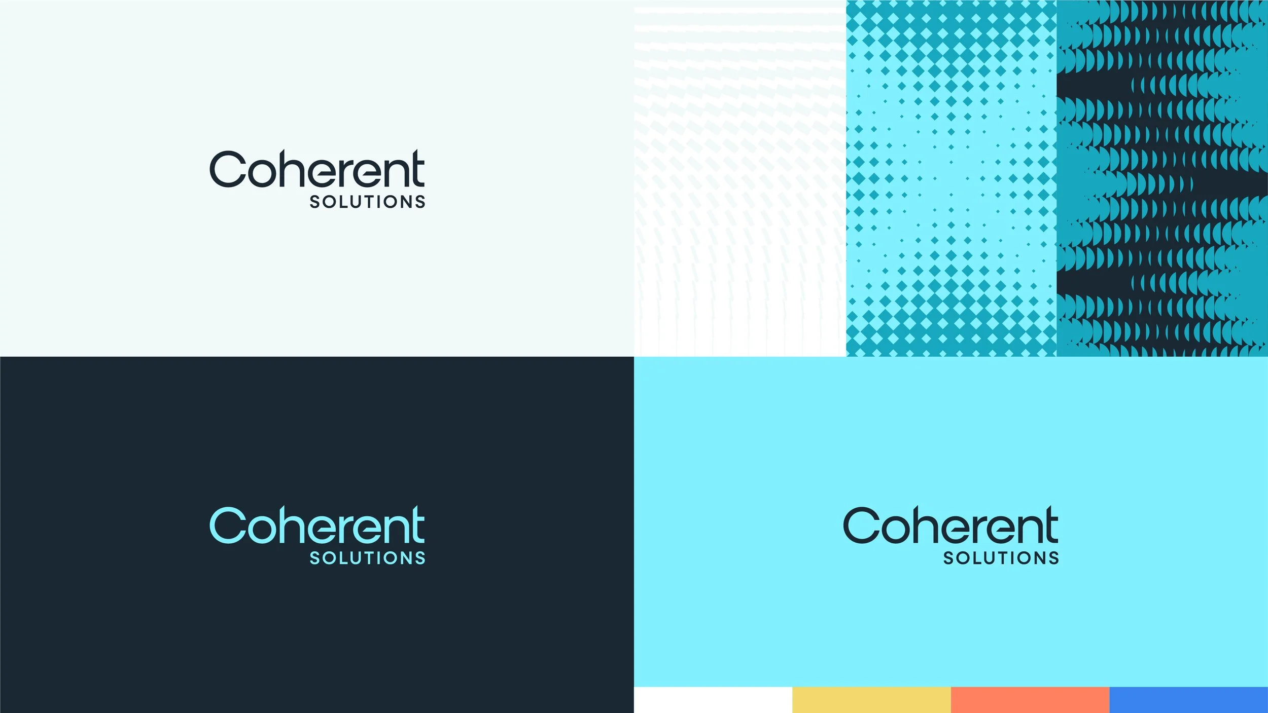
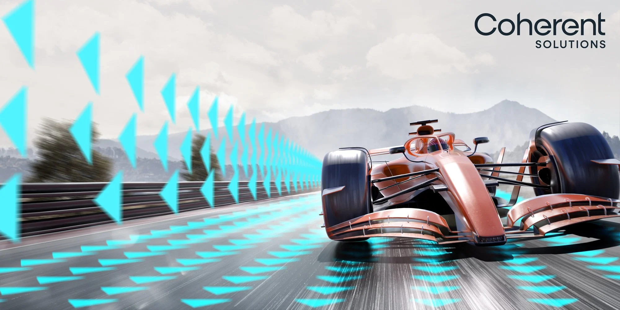
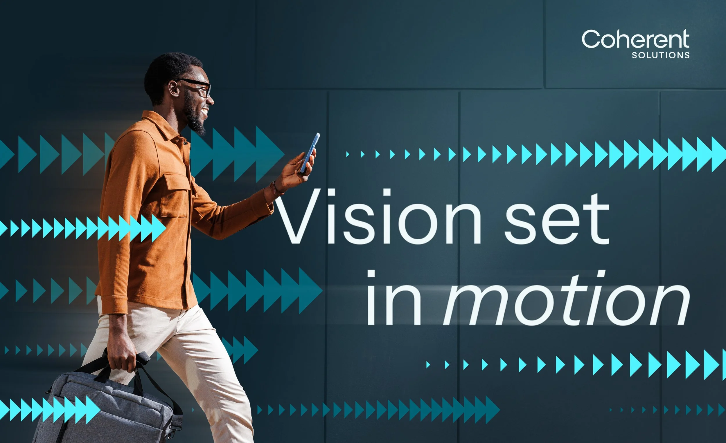
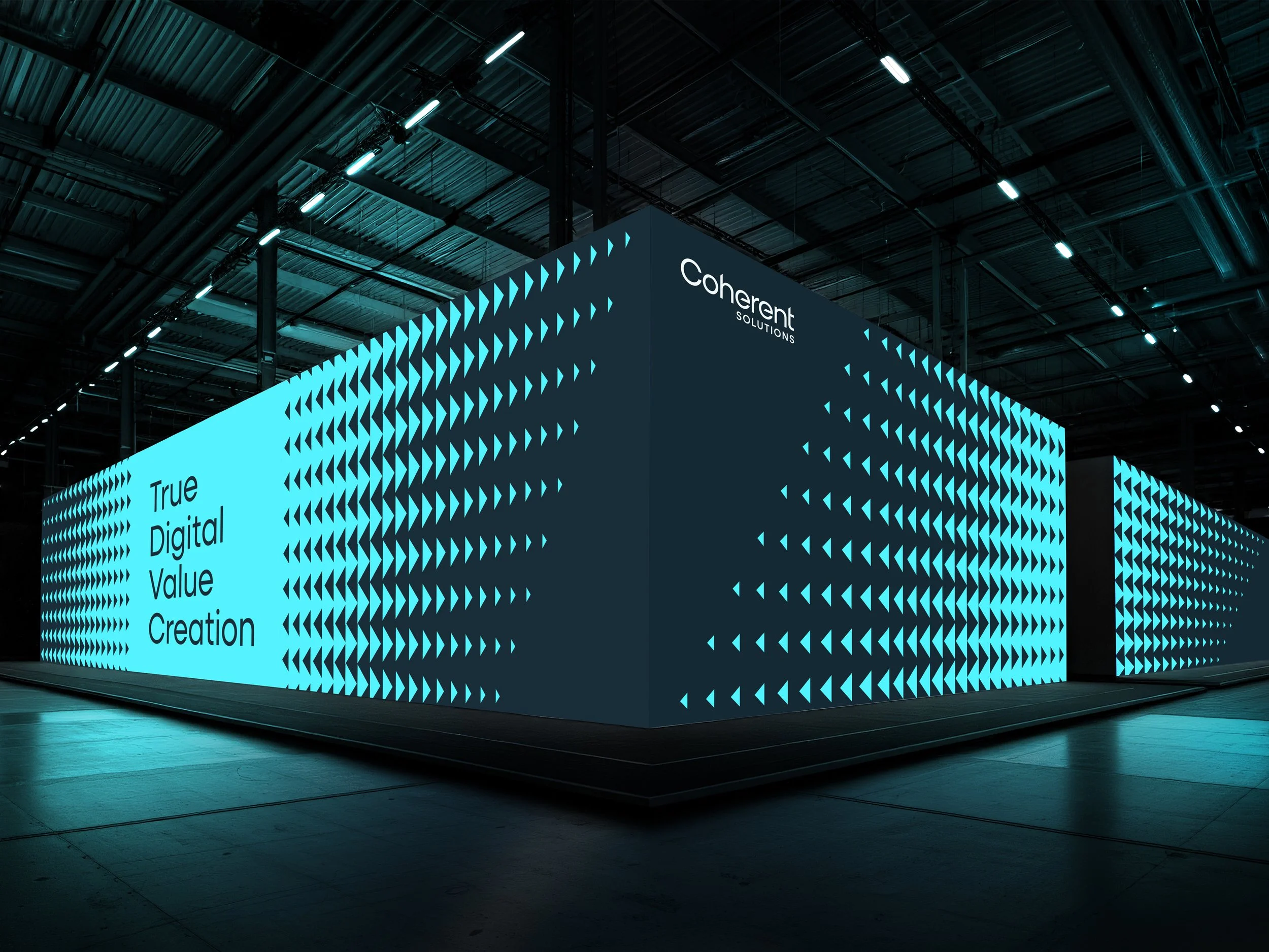
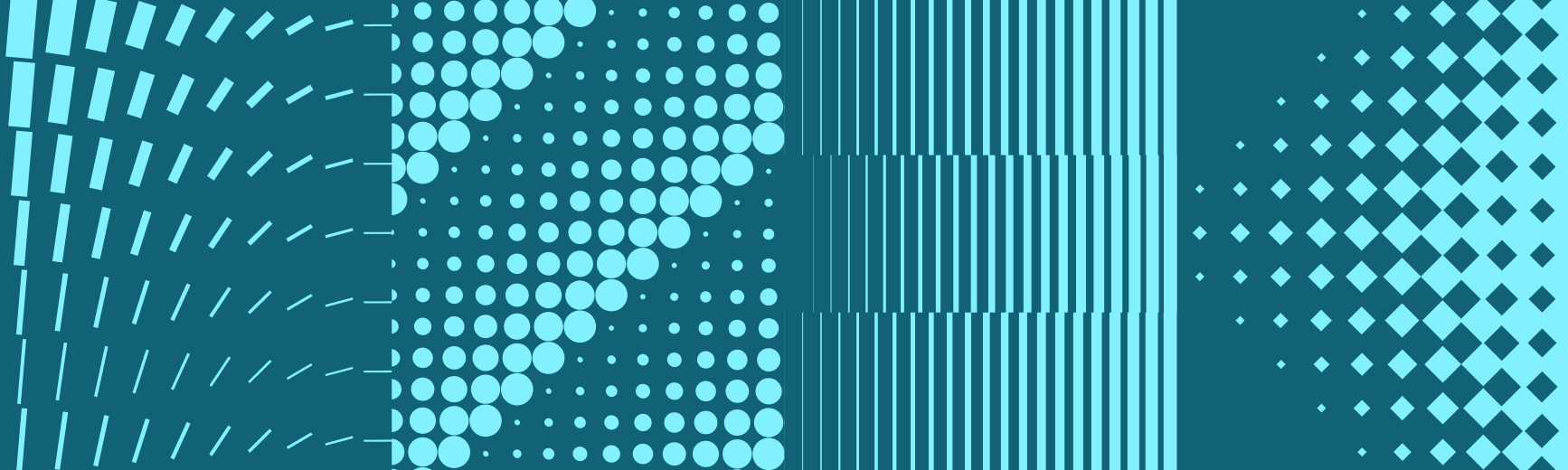
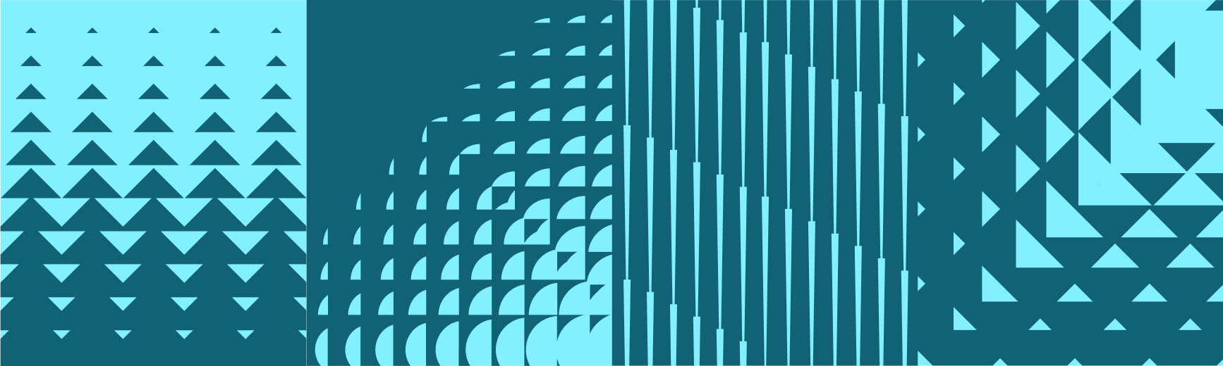
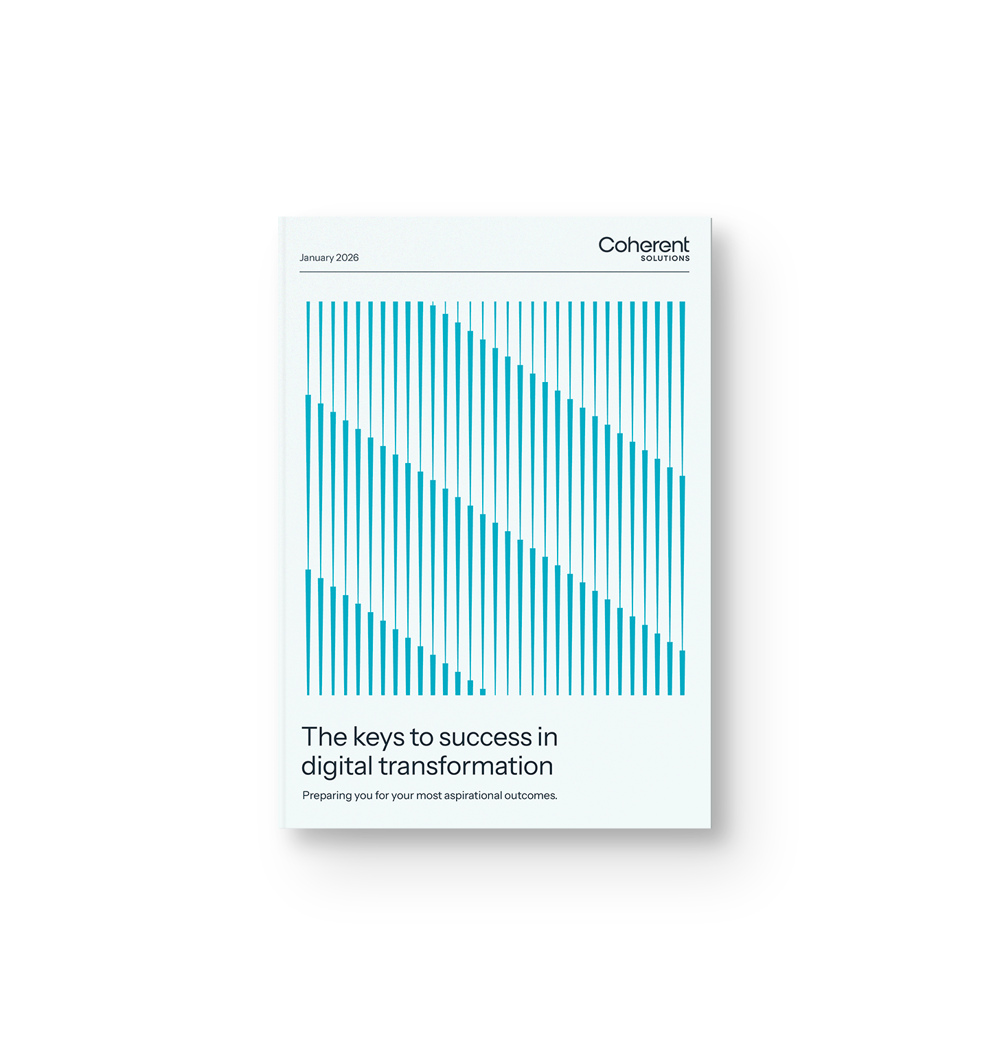
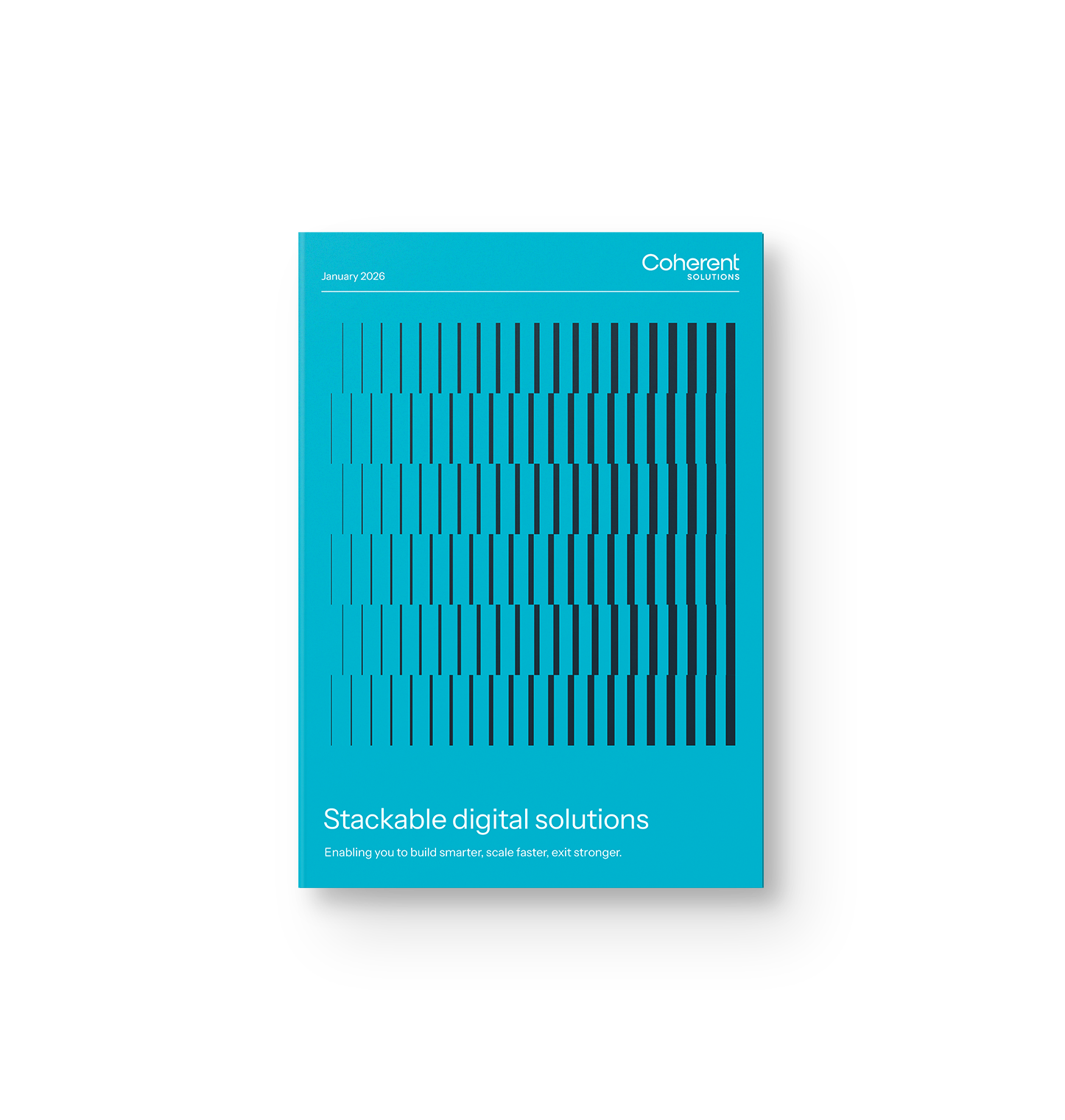
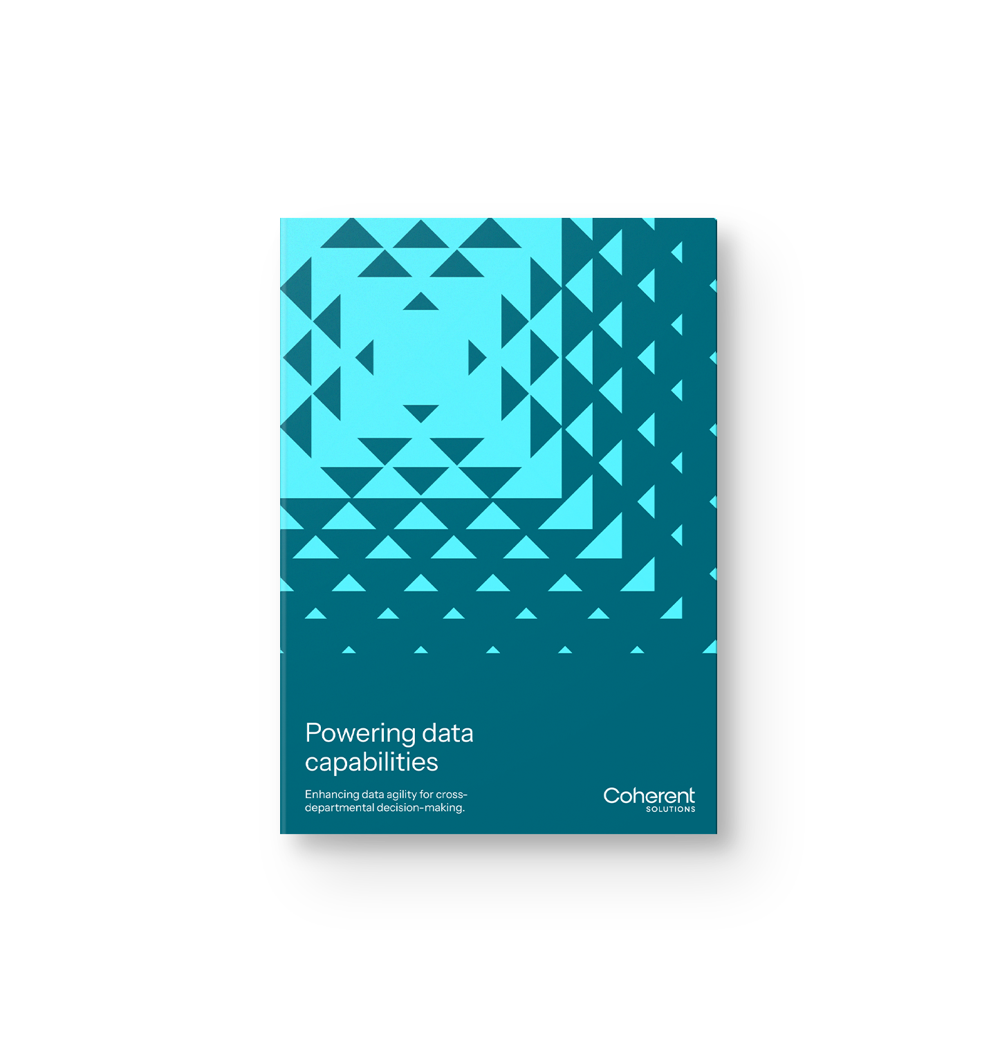
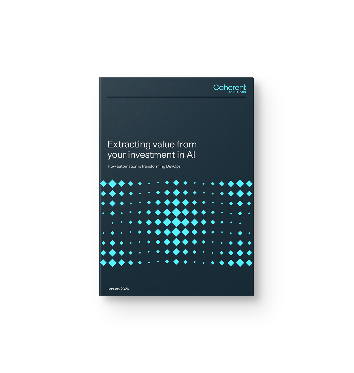
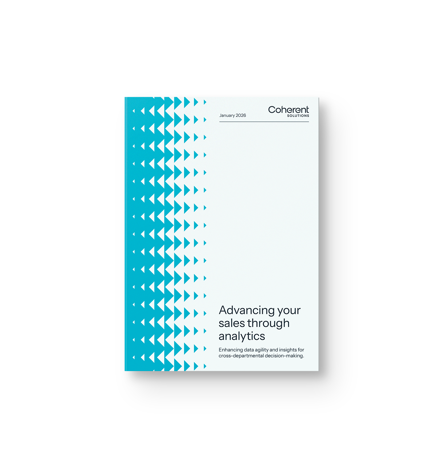
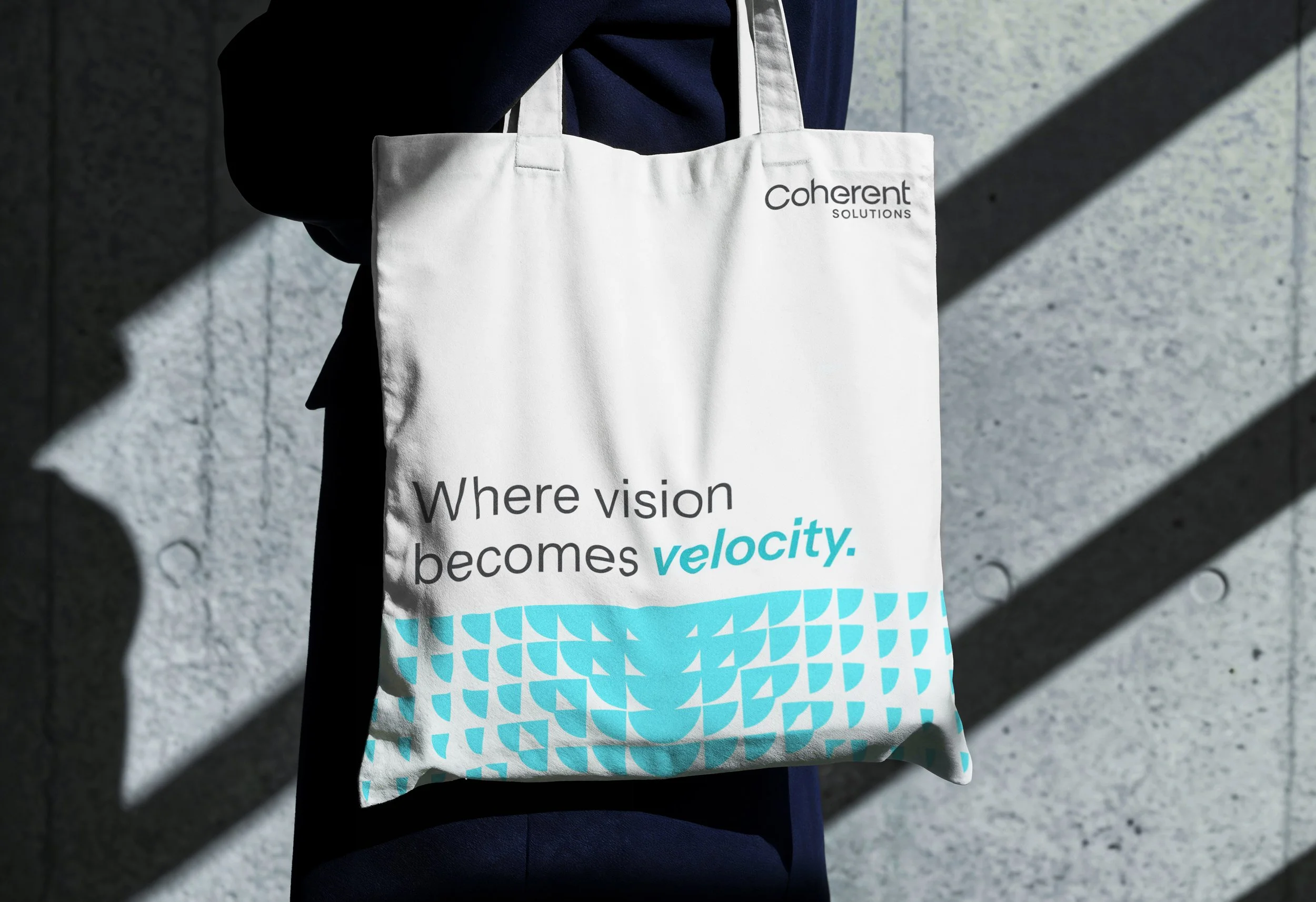
Brand Patterns
Expressing Alignment:
Focus
Efficiency
Synchronization
Partnership
Expressing Momentum:
Trajectory
Growth
Initiative
Execution
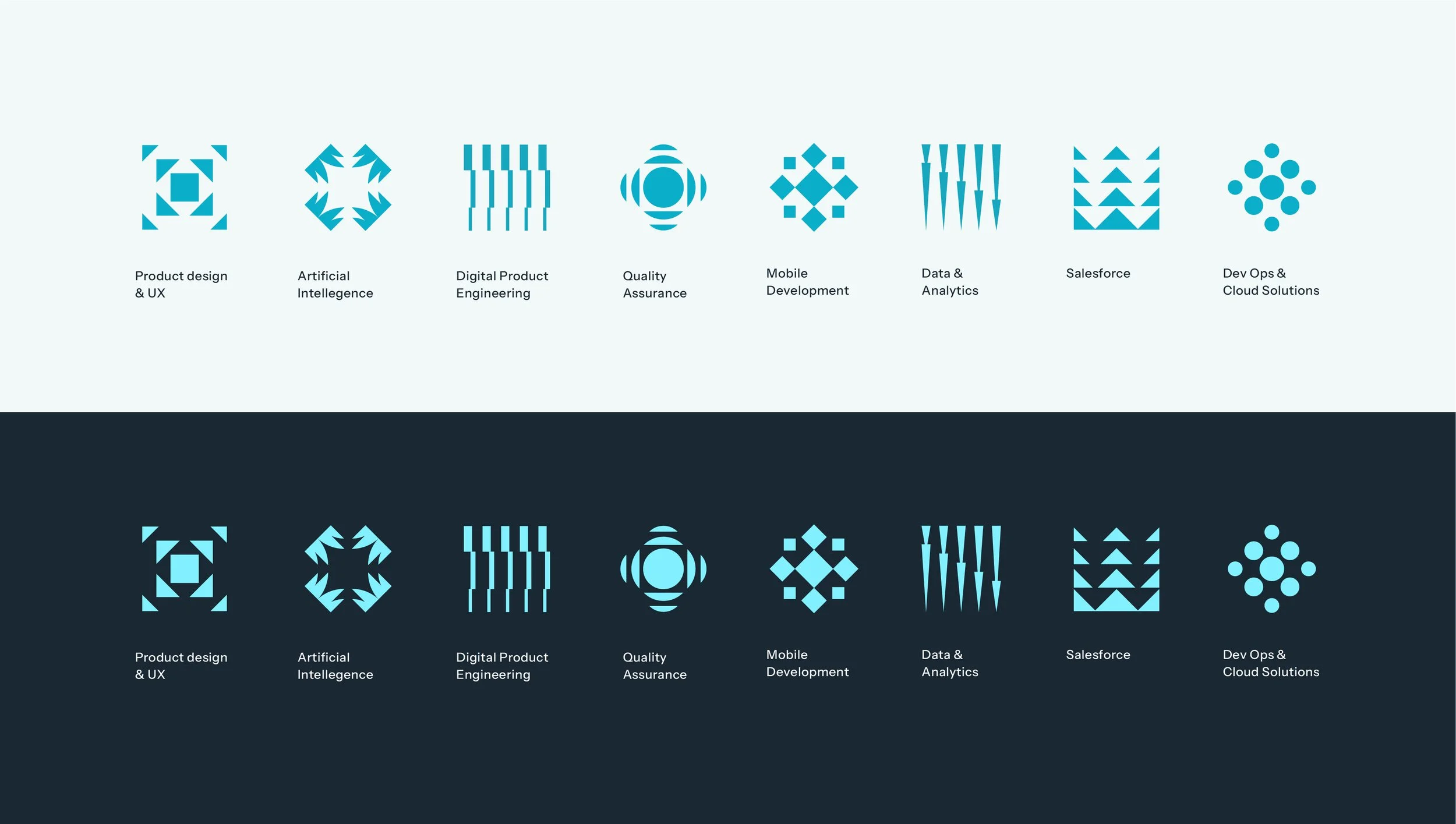
Service Icons
The strategic decision was made to exclude an icon in the primary logo, while building out unique icons derived from the brand pattern to represent each of the companies service offering.
Brand Guidelines
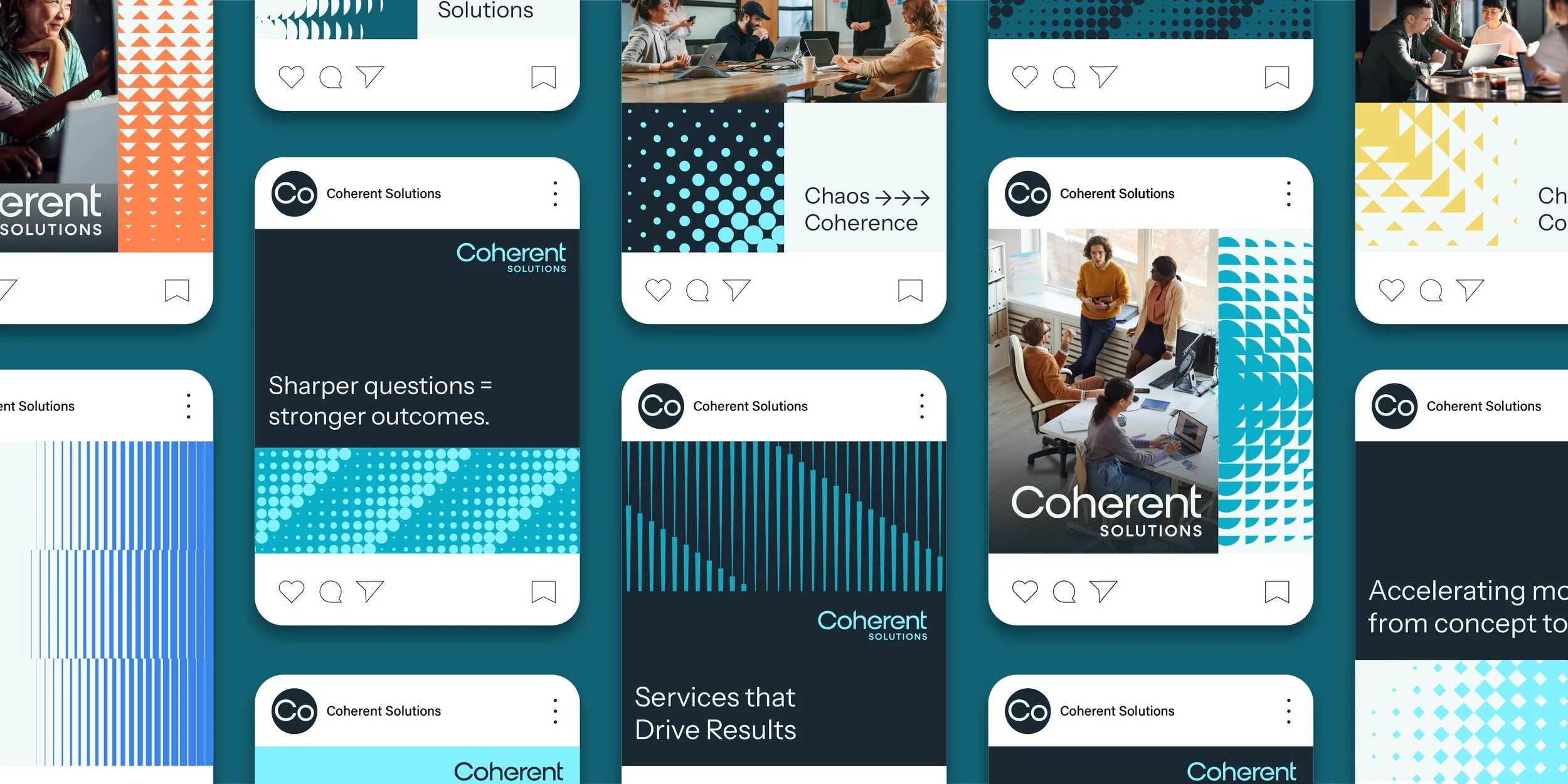
Social Templates
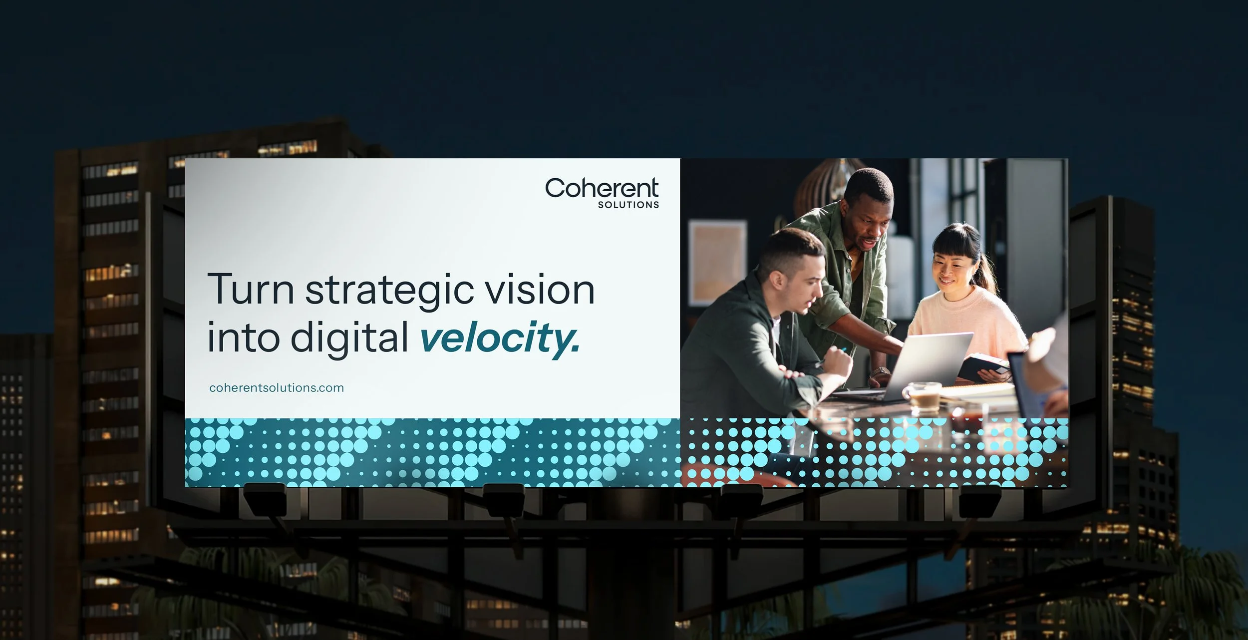
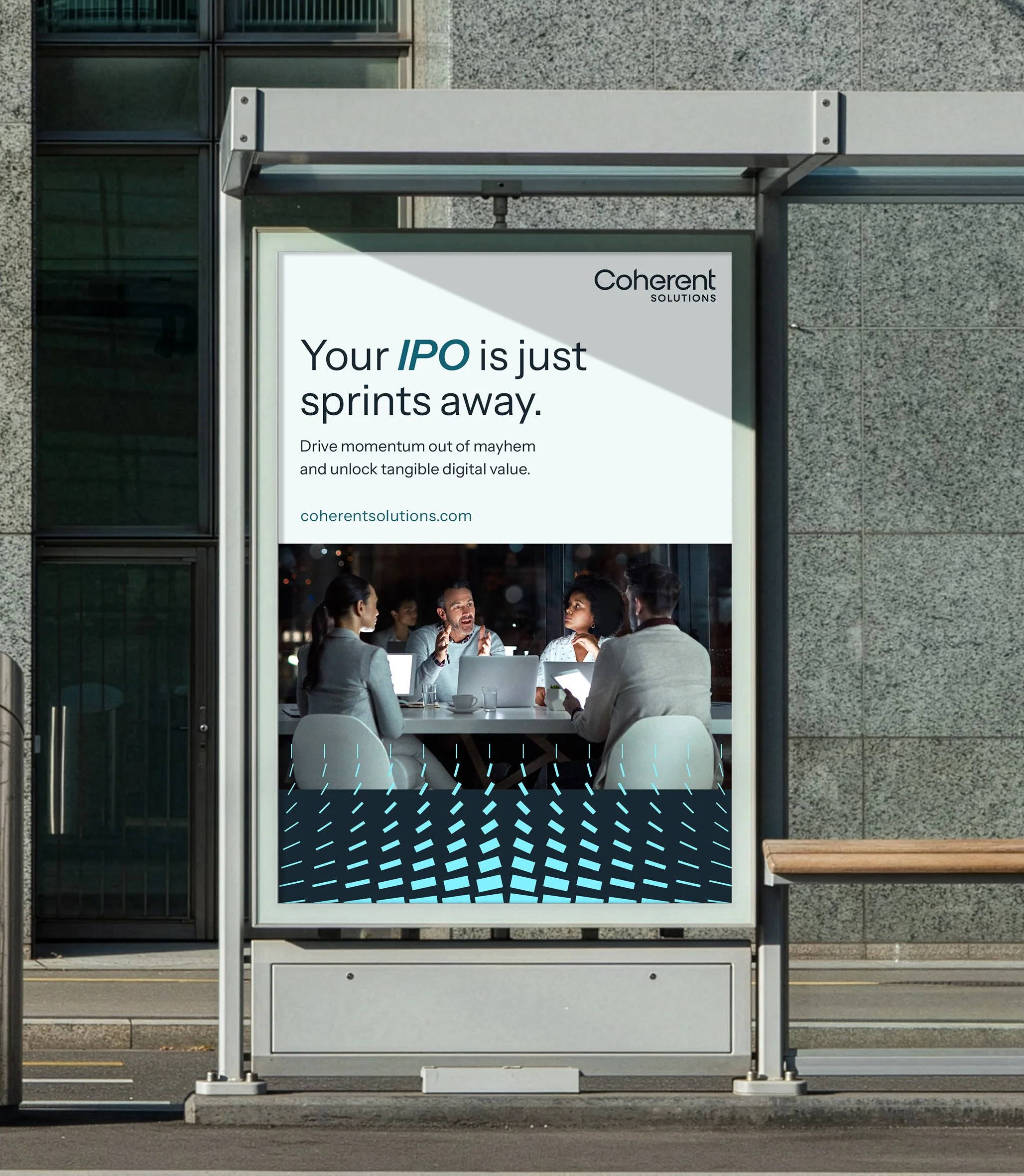
OOH Activations
Conference Materials
Additional Activations
Campaign Concepts