During my time as Senior Brand Designer at Material+ I contributed to a wide range of corporate branding projects & marketing campaigns. Client industries included healthcare, energy, fashion, food, entertainment and more. The project that most stands out is leading the visual identity development for Keurigs new rewards system.
My Role:
Creative Direction
Visual Identity
Email Design
Keurig Perks

Project Objectives
At the time, Keurig was —and remains a popular global brand, but they were falling behind in the market. Keurig’s needs for this engagement included developing an enticing visual identity for their rewards system that was approachable with a high perceived value to customers. We all believed a critical factor in achieving this goal and raising overall brand awareness was reaching a younger demographic through an increase in social media engagement.
Keurig Perks Branding
Social Media Facelift
The Risk
It just so happened at this very moment, a competitor—Dunkin was reeling from a massive failure after devaluing their own rewards system. They were being shredded across the media landscape. As you might imagine, this news made the folks at Keurig trepidatious about the investment of resources. Needless to say there was a lot of work to do to earn the trust of the Keurig team.
Research
With those goals and pitfalls in mind, my first course of action as always is research. The team and I spent a good deal of time pouring over Keurig’s existing brand and studying how it has been applied across various touchpoints. Looking into what’s working well, and figuring out what might be holding them back.
Findings
What I found was that their existing showcase photo style is very minimal, and clean, with a palette of warm muted brown tones. Though this aesthetic has served Keurig’s core audience well thus far, myself and the team felt the look was somewhat dated and ultimately contributing to pigeonholing them with a certain demographic.

Styleguide excerpts
Site section
Social media
Brand colors
Naming
Often times the naming stage is handled by strategists and writers exclusively, but I advocated for an all hands approach. In my experience, naming can be particularly tricky and time consuming. The legal hurdles tend to filter out 99% of possibilities before the client even gets a say. My frugal philosophy is to cast a wide net.

With contributions from the entire team, we’d compiled a list of one hundred or so names. We put them through the rigors of legal clearance, and internal vetting, we showed the client our favorites, each with a hearty backstory. Short, concise and appropriately on the nose. It had the sticking power the Keurig team desired…
“The convenience that Keurig offers is unmatched. I use my Keurig every day. Some days multiple times… I would love some sort of rewards program, and I’m sure I wouldn’t be the only one!”
- Candace B., Keurig Evangelist
Logo Considerations
Through informative conversations with the Keurig team, and thorough consideration of the definitive qualities of the core brand, the creative team and I decided the most appropriate solution would be a new wordmark lockup that incorporated the core KEURIG wordmark.
Explorations
Here you'll see some of my logo explorations. Instances where I’m trying things like using a modified version of Keurigs primary typeface, as well as ones that use their secondary slab serif. I looked into script and hand lettered options which I felt could imply a sense of fluidity.
In these instances I explore how to balance the parent logo with the perks mark; should it be bigger, smaller, nested, inline, stacked? What weight most evokes the tone we are after? Should it be uppercase, title case? Etc.

The Winning Mark
After a couple rounds of revisions, we have our final logo lockup for Keurig Perks. Where we landed is a modified, light setting of their primary typeface, all lowercase. It’s approachable, and unpretentious. It strikes a healthy balance in visual presence. There's appropriate contrast in weight between the two marks to help delineate. It sits nicely stacked and inline with minimal variance. One of the more subtle options, but a great centerpiece for an evolving legacy brand. The client loved it, and at the end of the day, that is what truly matters.


The Visual Language
Taking my learnings from the somewhat subdued final choice in logo, it seemed Keurigs appetite for change was conservative. In the brand extension phase, I fully expected to be confined to the tonal territory their users were familiar with. While I was given the go ahead to explore bold, fun directions, the last thing I wanted to do was offer up something off base that might sacrifice customer experience or brand recognition.
My team of designers and I set out on a wild to mild exploratory phase. We created some fun and funky identity work that nicely complimented the new logomark. We identified colors that incorporated the core brand, but gave an energy to this new youthful endeavor. We developed a celebratory pattern featuring chunky icons inspired by Keurig features and products, along with a selection of playful design elements and a unique photo framing.

Touchpoints
Keurig loved the work and immediately began incorporating the style into touchpoints from the website, to digital ads, to a dedicated email campaign for “Beta” members.

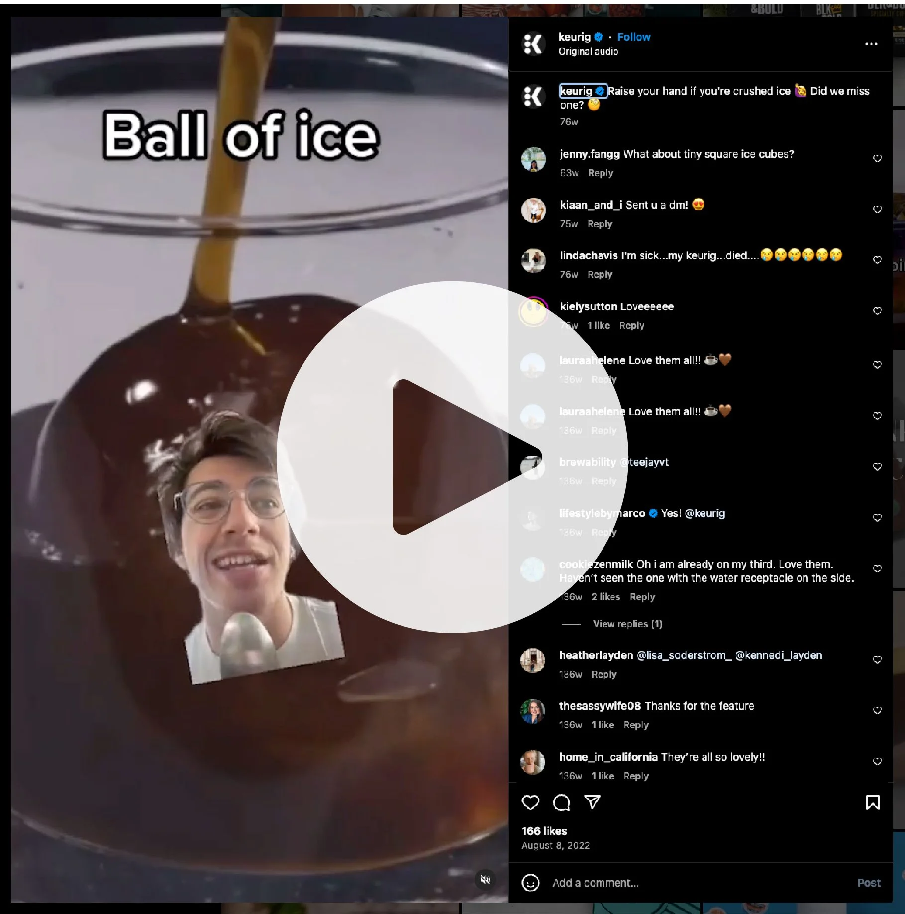
Being Social
With the core visual identity approved, the final step in our engagement was to translate this fresh tone of voice, and solve for Keurig’s social media aspirations. My immediate advice was to incorporate more of an organic, user generated feel into their Instagram.
Small changes can make a big impact; Show peoples faces more, have subjects in natural settings, leverage trends and influencers, etc. Overall make the feed less of a fashion show, and more of a casual coffee date.

Before

After

Influencer/organic posts

Embracing Influence
At a glance it’s clear to see the philosophy has been adopted, and has yielded a high level of engagement. I’m proud to say my team and I are responsible for pitching some popular campaigns like “my morning with Keurig” showcasing peoples morning routines, and how they incorporate Keurig products. And “How do you Keurig” that made for some hilarious and quirky Instagram posts.